Tuesday, 4 October 2016

La Storyboard Arteest!

Storyboard Artist

 [sorry for the unexciting presentation :( ]


A storyboard artist's job is to illustrate scenes of the film in a graphic format, to make the narrative clearer visually for the filmmakers, serving as a prominent visual aid.

The attributes a storyboard must have is to have a good understanding of film language, including compostion and layout for scene continuity, as well as the ability to be to tell a story through illustrations.
And as an obvious attribute, they must have exceptional drawing skills (and in the case of animation, digital editing skills).


Storyboard artists work alongside the director of the project, as well as the screenwriter and occasionally the producer. The storyboards are created as a way to visually piece together the character compostions, camera movements, and several vital lines of dialogue. These help to realise how each scene plays out, or at least the more prominent segments of the scenes, and are usually rough drafts to first map out how each scene will play out. If the director or scriptwriter isn't happy with certain scenes, another storyboard for the scene is drafted, and in some occasions several storyboards at once to map out various outcomes on how a scene plays out.

Storyboard panels are drawn out much like comic-strip panels, drawing up the action that may be difficult to coordinate without visual aid. As well as this, the storyboard panels also help plan certain shots and help maintain continuity between scenes.

Since the purpose of storyboard artists is to showcase the action of characters, camera movement and so on, storyboards are not nessesarily used for every genre of film, though can be employed if some scenes are difficult to map out. Genres such as period movies and dramas do not nessesarily use storyboards as those types of films are mainly driven through dialogue as opposed to action. 
Storyboards are very prominent in the following genres:
-Action
-Sci-fi/Fantasy
-Horror
-Comedy (for certain situations that require a lot of complex movement)
-Animation
Though this doesn't comply to ALL genres that follow a more dialogue-driven narrative, as storyboards are also used to plan out certain camera shots


A great example of a storyboard artist is Kurt Hartfelder, who worked on the Batman: The Animated Series.
He depicts the storyboard very much like a comic book (which makes sense given the subject matter) and as a result fantastically executes the actions and camera movements of each scene; an excellent example of this is the opening for each episode.


http://kurthartfelder.blogspot.co.uk/2010/08/batman-animated-series-storyboards.html


Another example of a very notable storyboard artist is Oscar Wright, brother of director 
Edgar Wright, whose most know for directing the "Three Flavour Cornetto Trilogy".
While only drawing up storyboards for Shaun of The Dead and Hot Fuzz, Oscar Wright was also the concept artist and designer of the main titles.
Oscar Wright's panels is very much in graphic style format, albeit less bold as Hartfelder's work, possibly due to the panels being roughs, in case the scenes get rewritten or redrafted. But despite this, the illustrations are bold and clear enough to understand the flow of the characters, actions and camera movements/compositions.
Storyboards are very important if the director wants to maintain continuity between scenes, especially if the scenes have several complexities to deal with at once, such as the compostion of the characters and camera movements. Though visual, panels also include notes alongside to verbal dictate how, for example, the camera moves and transitions between scenes.

As a visual aid, the director can also make choices in how to shoot and compose scenes much easier, and try out several scenerios in order to get the scene just how the director wants.

Films of lesser quality, may be quite evident in how storyboards were not applied, as well as overal poor direction, thus leading to not only a badly pieced together product, but also a film that has lumbering and dull, uninspired scenes.


Sunday, 6 March 2016

Twin-Screen Project: Idea


My idea for the twin screen project is a little vague narrative about a person travelling from one dimension to another, using the split-screen as the 'portal'.

The idea was going to use some green screen effects as well.
I planned to use a character/creature that resembles the chaotic from of both the natural world and the modernised human world fused as one.
The creature was to be my own version of the Green Man myths.

The theme/narrative of the film is that it is a divide between the systematic man-made world, and the disorderly, chaotic world.
In most media, a lot of people put emphasis on how "evil and orderly" the world of humans can be, but not many people tell of the unknown horrors of the "natural" world.

A person will walk through this portal, with the concept of escapism in mind. But finds how humans have evolved to the point where they can no longer survive in the "natural" world, lest the "supernatural" world.

Creature designs for Future projects


Requiem For Remembrance


Requiem For Remembrance
By Luke Furlong.

My five pictures depict different ways aspects of how quickly people are forgotten, and the horrible dismal truth of mortality as a hole.
We live in a world where people feel some sort of obligation to have some sort of identity and name for themselves, yet in the end it's ultimately futile.
All our times must come to an end soon, and with that comes the times when we are ultimately forgotten by the world around us. We are all part of a cycle, and perhaps we weren't meant to have an identity. We are part of the never-ending circle of life and death, and none of us will elevate above that.
This is what I hope to show within these photos. I wanted to leave them as unaltered as possible. This is just what I have found. They have not been manipulated. These are raw images, left to leave a message that our bodies and the memories of us will all eventually fade away from existence.
(Hope this was cheerful enough for you ^u^)


Friday, 18 December 2015

Artist Look: The Quay Brothers

Stephan and Timothy Quay (born 1947) are twin artists who are most famous for being influential stop-motion animators.
The brothers began animating in 1979 and are still present, having taken influences from several important polish artist, including animators Walerian Borowczyk and Jan Lenica.
They had had a huge influence on other artists too, such as Terry Gilliam, and the more contemporary internet artsit and animator David Firth.

The brothers have created several creepy and gothicly-toned animations inspired by dark polish short stories. Their most famous film is titled Street of Crocodiles.

Self Portrait: Octavio the Clown

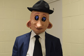
Octavio the Clown was a very minor background character in the 1983 gangster movie, Scarface. Octavio was a performer in the Babylon Club, a nightclub the main protagonist visits frequently, but is accidentally shot down during a crossfire. He presumably dies. He only appears for a few brief minutes in the movie; roughly two minutes at least.


In response, I had created an adapted version of this character that is much more fleshed-out in character than the original film version. I suppose because this one character stood out to me because of his very obscure appearance, I suppose I felt that I wanted to do him some justice to match his very strange physical appearance. I redesigned his character appearance slightly to show that he is a spirit, due to his demise in the movie, but his personality shines through his frightening appearance as a gentle, flamboyant, playful ghost who loves to dance, mingle, drink and make others laugh. However, his presence makes others wary of him and usually shun him as a malevolent creature.


Octavio was initially going to be part of an idea for the self portrait project, involving a series of different characters played by myself in different locations. However, Octavio and Mr Welldone were the only two characters developed enough before the idea was scrapped and the focus was entirely on Mr Welldone.

Maybe someday Octavio will appear in another project...

Thursday, 17 December 2015

MV Inspiration: BATTLES-Ice Cream Song


https://www.youtube.com/watch?v=-CXtJA34QGQ  -(For the Music Video)

Mainly throughout 1:20 to 2:12 in the timeline of the music video, this was some of my inspiration on how to edit and overlay scenes in my music video "Cherry Moon".
In the BATTLES video, random scenes quickly pop in and out of sequences as the song places, and though they seem quite separate in terms on context in how they relate, the editing in a way almost forces them to relate as the two scenes are 'spliced' and overlayed together to create movements among the images that are quite interesting to look at, and are quite humorous, which would not be seen with just a singular opaque scene playing one after another.
I thought this idea was a good way of representing my interpretation of relationships and connectivity; how there are two opposing factors but always that third party that's a lot more ambiguous but overall has control over both sides to create the relationship.